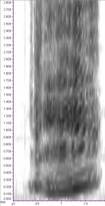
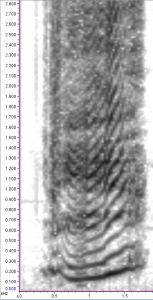
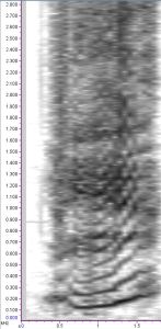
In my ongoing quest to classify individual right whales using upcalls, I’ve spent the past couple of weeks adding in some new parameters that may help discriminate among the animals. Following in our postdoc Holly’s footsteps, I’m adding amplitude measurements to see if amplitude variation is as important for right whales as it seems to be for wolves. In addition, I’m adding a categorical measurement of nonlinear phenomena classifications. What are nonlinear phenomena, you might ask? Although they sound like yet another Star-Trek-esque aspect of my project, Tyson et al. explain these phenomena quite well in their 2007 paper. In short, nonlinear phenomena occur when the vocal folds aren’t behaving themselves; think of how hoarse your voice gets while yelling, for example.
Before the Thanksgiving holiday, I went through spectrograms of all of my upcall clips and labeled them according to the type of nonlinear phenomena that were present in the calls. I wanted to double check my decisions to make sure I was on the right track, so I emailed Dr. Reny Tyson (Doug Nowacek’s former PhD student) to see if she would be willing to take a look. She responded with lightning speed and we have since been emailing back and forth about these upcalls and which phenomena are actually there. At first I was confused and somewhat disheartened when it seemed that I had gotten most of my classifications wrong, but then I looked at Reny’s spectrograms that she sent back to me, reminding me that not all spectrograms are created equal.
A spectrogram is a visual representation of sound, dependent on a number of user-defined parameters. In other words, there are a number of methods to take the same sound and end up with very different images. The various adjustments relate to an inherent tradeoff between time resolution and frequency resolution in the image: when digitally representing sound, you can’t simultaneously have high resolution in both aspects. Frequency resolution tends to get better as you increase the number of samples in each slice of the spectrogram, itself comprised of subsequent spectra. As you increase the number of samples per slice, though, the slices look wider along the x-axis, decreasing your time resolution but increasing your frequency resolution. Similarly, decreasing the number of samples per slice increases your time resolution at the expense of frequency resolution. There are some ways to “trick” the spectrogram into looking a bit nicer. For example, overlapping adjacent slices can recover some of the time resolution even when the slices have a high number of samples.


It’s a great reminder to be very specific and thorough when discussing your data with colleagues–especially when asking for help!
–Jess